Over the past few days we have been publishing the first major update of our data since early 2015. The data can be found here on our data page. Given the time of year and the wide ranging discussion about whether or not 2014 was a record year, it seemed a good time to asses the probability of 2015 being a record year. In addition, there is an interesting point to be made about how the selection of data and selection of methods can lead to different estimates of the global temperature index. That particular issue was addressed in the draft version of the IPCC’s 5th Assessment Report:
“Uncertainty in data set production can result from the choice of parameters within a particular analytical framework, parametric uncertainty, or from the choice of overall analytical framework, structural uncertainty. Structural uncertainty is best estimated by having multiple independent groups assess the same data using distinct approaches. More analyses assessed now than at the time of AR4 include a published estimate of parametric or structural uncertainty. It is important to note that the literature includes a very broad range of approaches. Great care has been taken in comparing the published uncertainty ranges as they almost always do not constitute a like-for-like comparison. In general, studies that account for multiple potential error sources in a rigorous manner yield larger uncertainty ranges.” ( Draft)
We will return to that issue, but first our results to date along with a estimate of how the year will end. We start with the land component.

While our record goes back to 1750, here we only show from 1850 to present. While we calculate an absolute temperature field, in order to compare with other dataset producers we present anomalies based on 1961-1990 period. The estimate for the year end ( the green bars ) is calculated by looking at the difference between Jan-Sept and Jan-Dec for every year in the record. This difference and its uncertainty is combined with the Jan2015-Sept2015 estimate to produce an prediction for the entire year. As the green bar indicates there is a modest probability that 2015 land temperatures will set a record.
In addition to a land product, we also create an ocean temperature product. The source data here is HADSST, however we apply our own interpolation.

The estimate for ocean temperature indicates a large probability of a record breaking year.
When we combine the Surface Air Temperature (SAT) above the land with an ocean temperature product and form a global temperature index we see the following:

Our approach projects an 85% likelihood that 2015 will be a record year. When we speak of records we can only speak of a record given our approach and given our data. We also need to be aware that focusing on record years can sometimes obscure the bigger point of the data. It is clear that the earth has warmed since the beginning of record keeping. That is clear in the land record. It is clear in the ocean temperature record, and when we combine those records into the global index we see the same story. Record year or not, the entirety of the data shows a planet warming at or near the surface.
Structural Uncertainty
As the quote from the draft version of AR5 indicated there is also an issue of structural uncertainty. Wikipedia gives a serviceable definition:
“Structural uncertainty, aka model inadequacy, model bias, or model discrepancy, which comes from the lack of knowledge of the underlying true physics. It depends on how accurately a mathematical model describes the true system for a real-life situation, considering the fact that models are almost always only approximations to reality. One example is when modeling the process of a falling object using the free-fall model; the model itself is inaccurate since there always exists air friction. In this case, even if there is no unknown parameter in the model, a discrepancy is still expected between the model and true physics.”
It may seem odd to talk about the global temperature index as a “model”, but at it’s core every global average is a model, a data model. What is being “modelling” in all the approaches is this: the temperature where we don’t have measurements. Another word for this is interpolation. We have measurements at a finite number of locations and we use that information to predict the temperature at locations where we have no thermometers. For example, CRU uses a gridded approach where stations within a grid cell are averaged. Physically this is saying that latitude and longitude determine the temperature. Grid cells with no stations are simply left empty. Berkeley uses a different approach that looks at the station locations and interpolates amongst them using the expected correlations between stations. This allows us to populate more of the map, and avoids biases due to the arbitrary placement of grid cell boundaries.
If we like, we can assess the structural uncertainty by comparing methods using the same input data: We did that here, and compared the Berkeley method with the GISS method and CRU method. That test shows the clear benefits of the BE approach. Given the same data the BE predictions of temperatures at unmeasured locations has a lower error than the GISS approach or the CRU approach.
However, comparisons between various methods are usually not so clean. In most cases, not only is the method different, but the data is different as well. Below see a comparison with the other indices, focused in particular on the last 15 years.

The differences we see between the various approaches comes down to two factors: Differences in datasets and differences in methods. While all four records fall within the uncertainty bands, it appears as if NCDC does have an excursion outside this region; and if we look towards years end, it appears that their record shows more warmth than others.
In order to understand this we took a closer look at NCDC. I will start with some material we created while doing our original studies. Over the course of the climate debate some skeptics and journalists have irresponsibly insinuated that the GHCN records have been “manipulated”. This is important because CRU and GISS and NCDC all use GHCN records. We can test that hypothesis of “manipulation” by comparing what our method shows using GHCN data and then comparing that with non-GHCN data. If the hypothesis of “manipulation” were true, we would expect to find differences or evidence that the record was being “manipulated”. We reject that hypothesis.
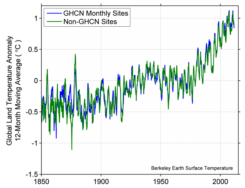
This implies is that the reason for the difference between NCDC and BE probably doesn’t lie entirely in the choice of data since we get the same answer whether we use GHCN data or not. It suggests that the NCDC method or some interaction of data and method is the reason for the difference between BE and NCDC.
Since NCDC use a gridded approach there is the possibility that the selection of grid size is driving the difference. We see a similar effect with CRU which uses a 5 degree grid. That choice results in grid cells with no estimate. In short, they don’t estimate the global temperature. To examine this we start by looking at the Berkeley global field:

There are two things to note here. First the large positive anomaly in the Arctic and second the cool anomalies at the South Pole. In some years we will see that CRU has a lower global anomaly because they do not estimate where the world is warming the fastest: the Arctic. This year, however, we have the opposite effect with NCDC. They are warmer because of missing grid cells at the South Pole. The “choice” of grid cell size influences the answer: As we can see some years the choice of grid cell size results in a warmer record, and other years a cooler record.

Since NCDC uses GHCN data and since they use a gridded approach with grid cells that are too small, they end up with no estimate for the cooling South Pole. The end result is a temperature index that runs hotter than other approaches. For example, both GISS and Berkeley Earth use data from SCAR for Antarctica. When you combine SCAR with GHCN as both BE and GISS do, there are 86 stations with at least one month of data in 2015.
GISS can be viewed here. With 1200km gridding the global average anomaly for September is .68C. If we switch to 250km gridding, the anomaly increases to .73C. This year, less interpolation results in a warmer estimate. Depending on the year and depending on the warming or cooling at either pole, the very selection of a grid size can change the estimated anomaly. Critics of interpolation may have to rethink their objections.
2015 looks like it is shaping up to be an interesting year both from perspective of “records” and from the perspective of understanding how different data and different methods can result in slightly different answers. And it’s most interesting because it may lead people to understand that interpolation or infilling can lead to both warmer records and cooler records depending on the structure of warming across the globe.