During our analysis period, 92% of the population of China experienced >120 hours of unhealthy air (US EPA standard), and 38% experienced average concentrations that were unhealthy. China’s population-weighted average exposure to PM2.5 was 52 μg/m3. The observed air pollution is calculated to contribute to 1.6 million deaths/year in China [0.7–2.2 million deaths/year at 95% confidence], roughly 17% of all deaths in China.
Starting in 2012 China began the development of an air quality monitoring system that now includes over 900 stations in nearly 200 cities. These stations report hourly data on PM2.5 , PM10, SO2, NO2, O3, and CO. Unlike other studies that relied on modelling or satellite observations, our study compiled data from ground stations. The density of the stations and the frequency of reporting allowed us to build area estimates for each of these pollutants.
That data has been compiled into datasets available in our data repository, but for a quick idea of what the data actually looks like over time, this youtube video helps:
In addition, we provide a real time google map view of pollution over China
One of the challenges was establishing a quality control procedure for the data. Since onsite surveys of over 900 stations and instruments was precluded, we had to rely on statistical methods for assessing the data quality and for reducing the impact of outliers, badly calibrated instruments, and other possible problems. For example:
The most common quality problem was associated with stuck instruments that implausibly reported the same concentration continuously for many hours. A regional consistency check was also applied to verify that each station was reporting data similar to its neighboring stations. Approximately 8% of the data was removed as a result of the quality control review.
In addition, if sites reported less than 30% of the time or if they had probable errors on latitude/longitude locations (33 sites) they were eliminated from the analysis.
The approach taken to generating the fields was similar to that taken in our temperature analysis where kriging was employed. One aspect of the approach that merits comment is the smoothing we employ to improve overall estimates:
An additional feature of the correlation function, … is the correlation at zero distance, R(0). With perfect data one would expect R(0) ≈ 1, but this diverges from unity as a result of “noise” in the data, including instrumental noise, errors in reported station location, and ultra-local pollution sources that don’t significantly impact more than one station. The fraction of variance in the typical station record attributable to such “noise” can be estimated as 1 – R(0). The analysis framework was intentionally designed to allow for R(0) < 1 as a method of compensating for noisy and erroneous data. With R(0) < 1, the interpolated field will not exactly match the observations at a station location, but instead the field will be somewhat smoother in a way that attempts to compensate for the typical level of noise in the observations. Along with the quality control steps described above, this approach plays an important role in controlling for potential problems in the data set.
With the quality control procedures that reject outliers and the smoothing of kriging , one obvious question is does the approach still allow us to capture “spikes” that are real rather than outliers and, on the other hand, does the smoothing gloss over local minima?

Shown above is the average PM2.5 over China from April 2014 through August of 2015. The spike which looks like it might be an outlier is Chinese New Year, Feb 19, 2015.
While the Chinese government put some restrictions on fireworks we are still able to see a marked difference in the time series. Our work in 2015 comports well with a detailed look at CNY in 2014 . In this case, it would appear, that the quality control processes is retaining “meaningful” or real spikes in the data streams.
Clear Skies.
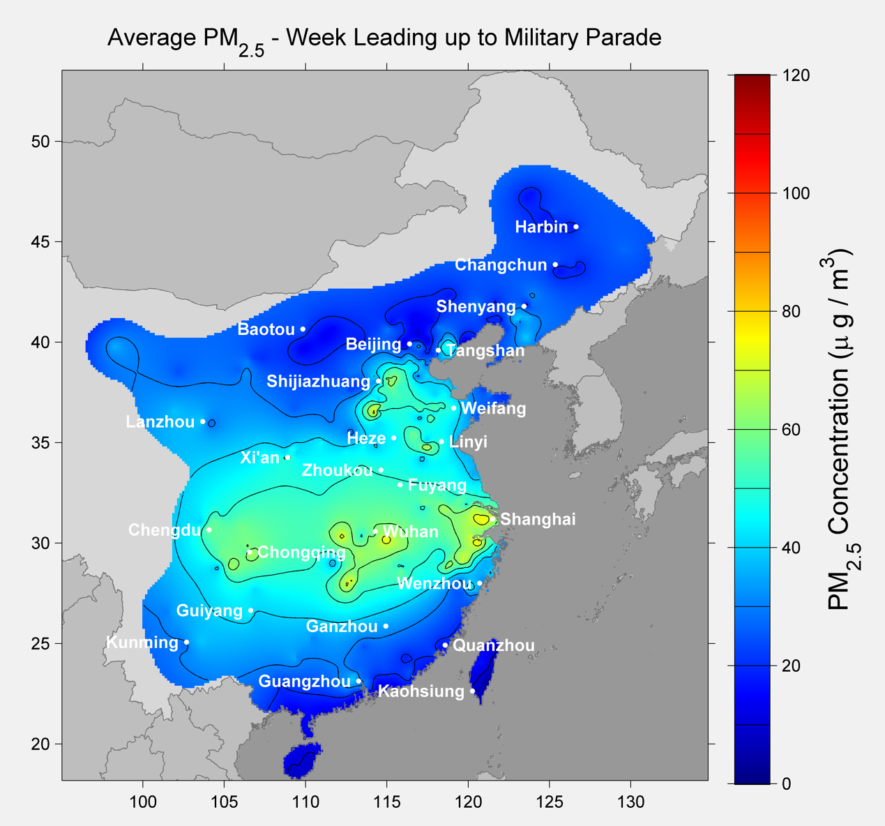
The other concern, related to the ‘smoothing” of the kriging approach, is how the method will handle the other extremes: Are clear sky days preserved?
Prior to the parade our method gives the following picture of PM2.5 concentrations:

Contrast that with the data from the same week in 2014, as shown below:

The relative difference ( decrease in concentration ) is shown below:

The preparations required to clear the sky involved shutting down over 10,000 businesses:
China plans to stage its biggest military parade in years next week, as 12,000 soldiers and assorted tanks and missiles take to the capital’s streets to celebrate the defeat of invading Japanese forces 70 years ago. But for many here, the victory parade is meaning a loss of business. To clear the capital’s notoriously dirty air before delegates from 30 countries arrive next week, China has ordered more than 10,000 factories and a number of construction sites in and around Beijing to close or reduce output. Officials have put new limits on drivers, local shop owners and even electronic commerce, citing concerns about security and traffic.
While there is much to comment on relative to man’s impact on air quality in both these cases, the focus of our research was collecting and preserving the observational record so that policy makers can make informed decisions. Showing that both types of extremes are preserved with the methodology increases our confidence in the quality of the data and method


