Graphics: Physical Effects of Warming

Global Warming and Changing the Range of Seasonal Temperatures

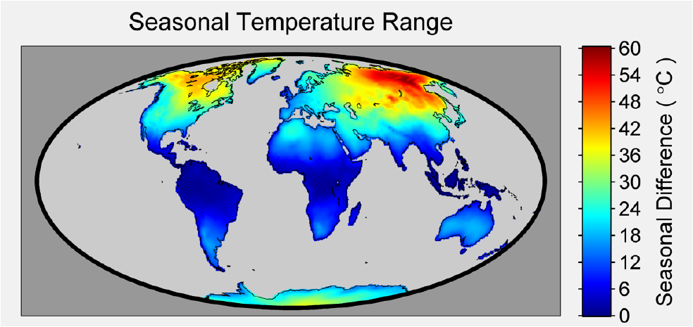
Baseline Seasonal Temperature Range

Figure 1. Using the Berkeley Earth Surface Air Temperature (SAT) dataset the seasonal temperature range was calculated over the entire land surface of the globe. For the purposes of this map the seasonal range was defined as the difference between the warmest month and the coolest month. The difference ranges from a low of 0 degrees C in equatorial regions to a high of 60 degrees C in northeastern Russia. While not as dramatic as the ranges found in Siberia, the seasonal range in northern Canada is also large. Other features, such as the muted seasonal range along coastlines, in particular the western North American coast, are visible.

Seasonal Temperature Shifts Since 1900

Figure 2. The spatial pattern of global warming that emerges over the 20th century is not uniform. In this figure the change in seasonal range is shown to vary by location. The figure was produced by taking the average of the seasonal range in the 30 year period from 1900 to 1930 and computing the difference from the seasonal range for the 1980-2010 period. A negative value indicates the seasonal range has narrowed (e.g. winters warming faster than summers) while a positive value indicates the range has widened (e.g. summers warming faster than winters, or winters cooling while summers are warming). Three distinct patterns emerge: those areas where there is little change in the season range, small areas where the range as increased, and areas in northern latitudes which indicate a narrowing of the difference between the coldest months and the warmest months.

Global Warming Since 1900: Winter (Northern Hemisphere)

Figure 3. This figure illustrates the change in temperature over the past 80 years during December-January-February (the Northern Hemisphere winter season). Warming during this season is not uniform across the globe, with maximum values occurring in the northern latitudes.

Global Warming Since 1900: Spring (Northern Hemisphere)

Figure 4. The change in temperature during March-April-May, like that in Dec.-Jan.-Feb., is not uniform across the globe. With the exception of Greenland, which sees nearly no change in temperature over the period, the changes in the northern latitudes outpace the changes at lower latitudes.

Global Warming Since 1900: Summer (Northern Hemisphere)

Figure 5. The change in temperature over the June-July-August months is nearly uniform across the globe, unlike the northern hemisphere winter and spring months.

Global Warming Since 1900: Fall (Northern Hemisphere)

Figure 6. The change in temperature during September-October-November is not as uniform as the northern hemisphere summer months; and while North America sees very little temperature change during this season, parts of Russia and China appear to see greater changes in temperature during these months.

Global Warming and Permafrost Melt

Permafrost Melt Since 1900

Figure 7. Permafrost, or cryotic soil, is defined as soil that is at or below 0C for 2 or more years. In the above figure we use the air temperature estimated by the Berkeley Earth averaging method to create an estimate of permafrost extent and its retreat over the last hundred years. While factors other than air temperature do play a role in the formation of permafrost (such as the slope and aspect of the terrain), the average annual air temperature does provide a good estimate of where permafrost has formed. Regions where the annual air temperature averaged 0C or below for the 1901-1910 time period are colored in red, while those areas that were 0C or lower during the 2001-2010 period are colored in white.

Area of Permafrost Melt Since 1900

Figure 8. This figure shows the decline in permafrost potential over the 1850 to 2013 time period. The permafrost potential is defined by the decadal air temperature. If the annual average temperature over a 10-year period was 0C or below, then that area was regarded as permafrost. Over the 1900-to-present time span, roughly 4.5 million sq. km of potential permafrost area has been lost.

We have updated our Privacy Policy to reflect the use of personalized advertising cookies placed on our website. By continuing to use our site, you acknowledge that you accept our Privacy Policy.

I accept